University of Phoenix
Email RedesignCLient
- University of Phoenix
Services
- Email Design
- Landing Page Design
- Design System Build
- Component Library
Deliverables
- Redesign All Pre-Prospect Emails
- Design Email Templates
- Build Figma Design Component Library
- Move from Responsys to AJO (Adobe Journey Optimizer)

Project Info
Challenge
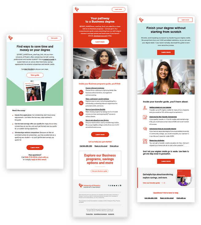
The previous University of Phoenix pre-prospect emails faced several design and usability issues that hindered their effectiveness. They used a limited color palette and had poor readability, which impacted visual engagement and accessibility. The design did not align with the university’s updated website, creating a disjointed brand experience. Additionally, the emails were not fully ADA compliant, featured outdated imagery, and lacked clear, compelling calls-to-action—making it difficult for potential students to understand their next steps. Overall, the emails appeared outdated and were ineffective in guiding users through the enrollment journey.
Old Design

Solution
Redesigning the University of Phoenix’s pre-prospect emails presented the challenge of engaging a diverse audience—ranging from working adults to first-time college students—while building trust and clearly communicating value. The emails needed to be concise yet informative, with a tone that felt both credible and approachable. Maintaining brand consistency across platforms, designing for mobile responsiveness, and crafting clear, action-driven CTAs were essential to driving conversions. Balancing personalization with scalability and continuously optimizing through testing added further complexity, and user-focused redesign effort.
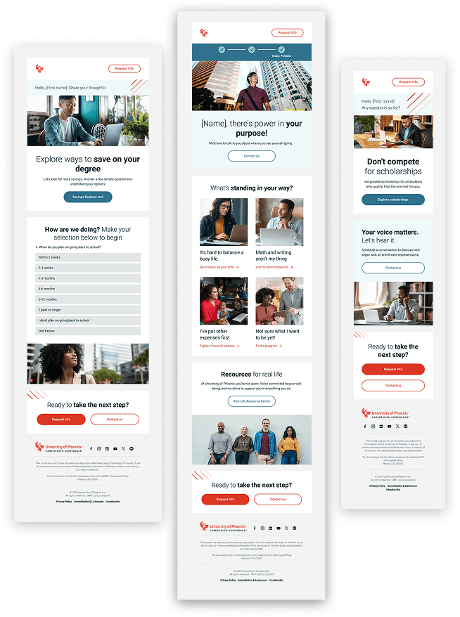
Redesign


Email Design
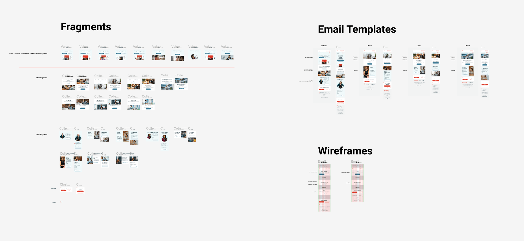
Responsive Email Templates Build from Fragments
The redesign of the University of Phoenix pre-prospect emails marked a significant step toward modernizing the institution’s digital communication strategy. By transitioning from the legacy Responsys platform to Adobe Journey Optimizer (AJO), we unlocked the ability to create more dynamic, personalized experiences. The outdated, top-down email structure was replaced with a modular and fragmented design system, enabling email components to adapt based on user interactions across both emails and the website. This modular approach not only improved scalability and consistency but also allowed for real-time content personalization, creating a more seamless and engaging journey for prospective students. Combined with a refreshed visual design, improved accessibility, and alignment with the university’s current branding, the new system brought UOPX’s email communications into a more modern, user-focused era.

