CLient
- La Quinta Brewing Co. during my time with SCORR Marketing
Services
- Label Design
- Graphic Design
- Illustrations
Deliverables
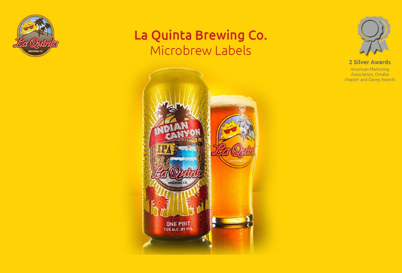
- 4 microbrew labels
Project Info
Challenge
Designing four microbrew labels for La Quinta Brewing Co presents several challenges, including ensuring consistency in brand identity across all labels while still allowing each beer to have its unique personality and style. The labels must also adhere to certain legal requirements, such as including the necessary alcohol content and government warnings. Additionally, each label must effectively communicate the key attributes of the beer it represents, such as flavor profile, ingredients, and brewing process. Lastly, the design must be visually appealing and eye-catching to stand out on crowded shelves and attract customers’ attention. Balancing all of these factors while creating distinct and memorable designs for four different beers is a complex and demanding task for any designer.
Solution
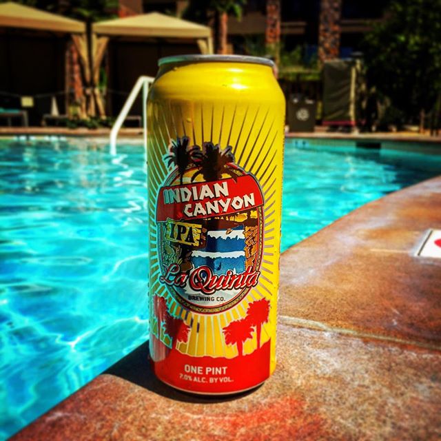
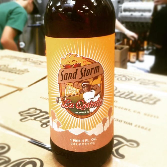
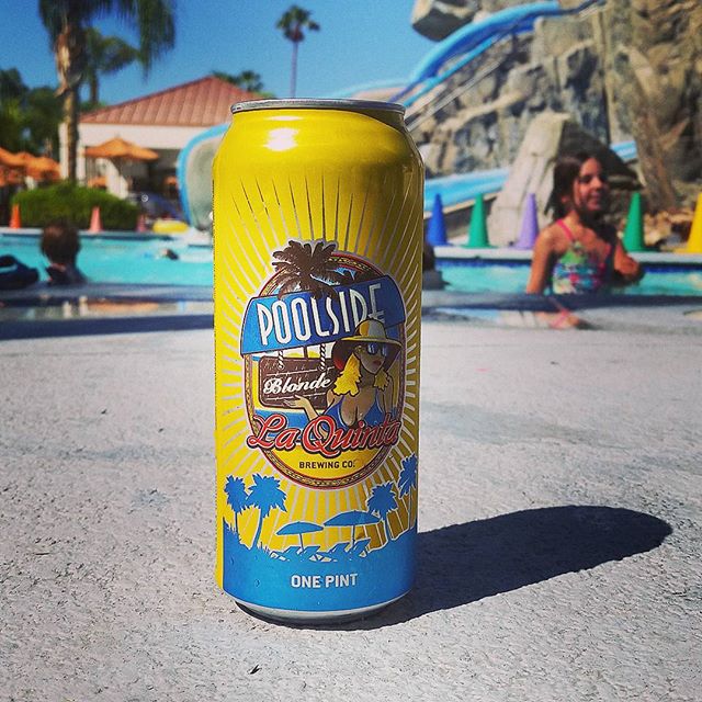
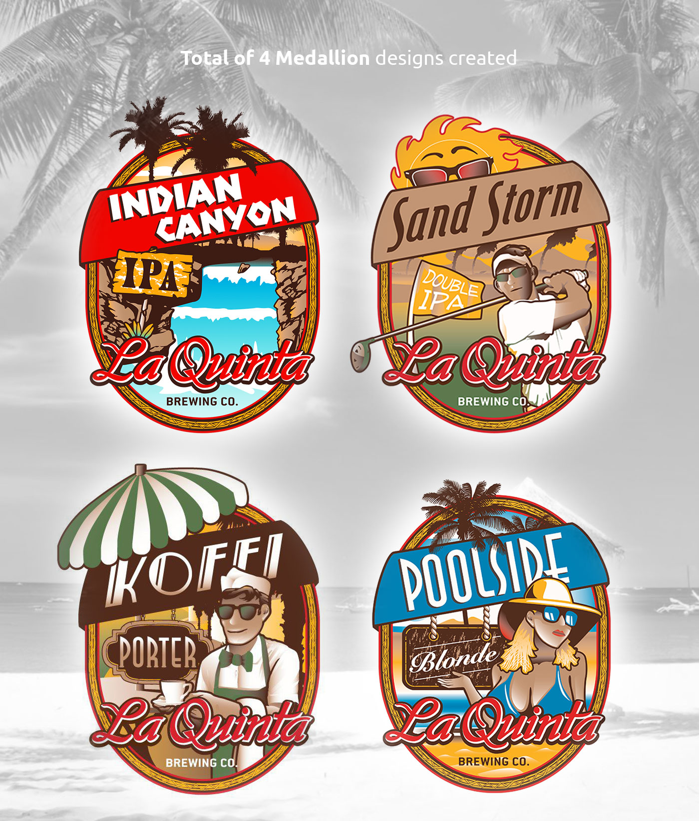
For La Quinta Brewing Co’s microbrew labels, I started by drawing inspiration from the vibrant and sun-soaked atmosphere of Palm Desert. Each label was designed to capture the essence of the desert oasis, with elements such as palm trees, cacti, and bright colors. To tie in the vintage pin-up theme, I incorporated retro-style fonts and illustrations reminiscent of classic 1950s posters. For Poolside Blonde, I created a playful and inviting label featuring a sunbathing pin-up girl lounging by a pool. The Koffi Porter label showcased a barista delivering a cup of coffee under a desert sunset, while Sand Storm Double IPA featured a wind-blown pin-up with swirling sand and desert mountains in the background. Lastly, the Indian Canyon IPA label depicted a pin-up exploring a desert canyon, complete with cacti and desert flora. Overall, the designs aimed to evoke a sense of nostalgia and capture the essence of Palm Desert’s laid-back and sunny vibes.
label design
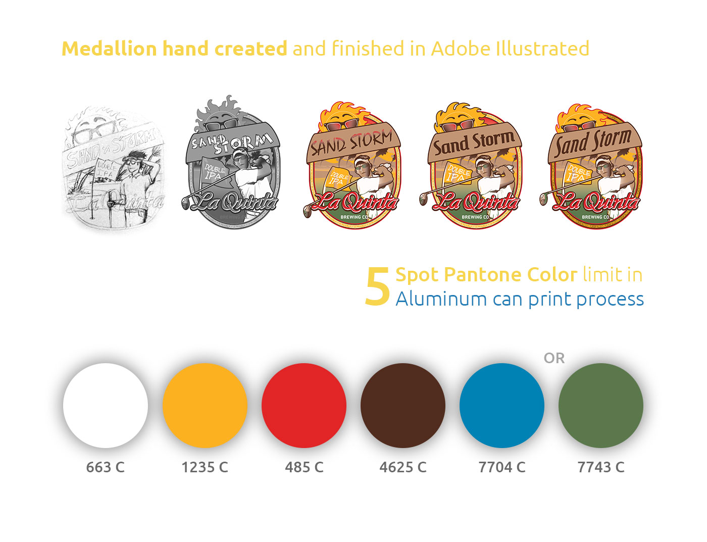
Taking each Design from Paper to Vector
I began by researching vintage pin-up posters and iconic imagery of Palm Desert to create a unique and cohesive theme for La Quinta Brewing Co’s microbrews. Using a limited color palette of 5 spot Pantone colors, I sketched out intricate designs for each label, incorporating elements like retro fonts, bold graphics, and vibrant desert landscapes. After finalizing the designs on paper, I meticulously translated them into vector format, ensuring clean lines and precise details for the can printing process. The end result is a series of visually striking and cohesive labels that capture the essence of both the pin-up era and the distinctive beauty of Palm Desert, creating a standout brand identity for La Quinta Brewing Co’s microbrews.
physical Product
Microbrew Cans and Bottles out in the Wild
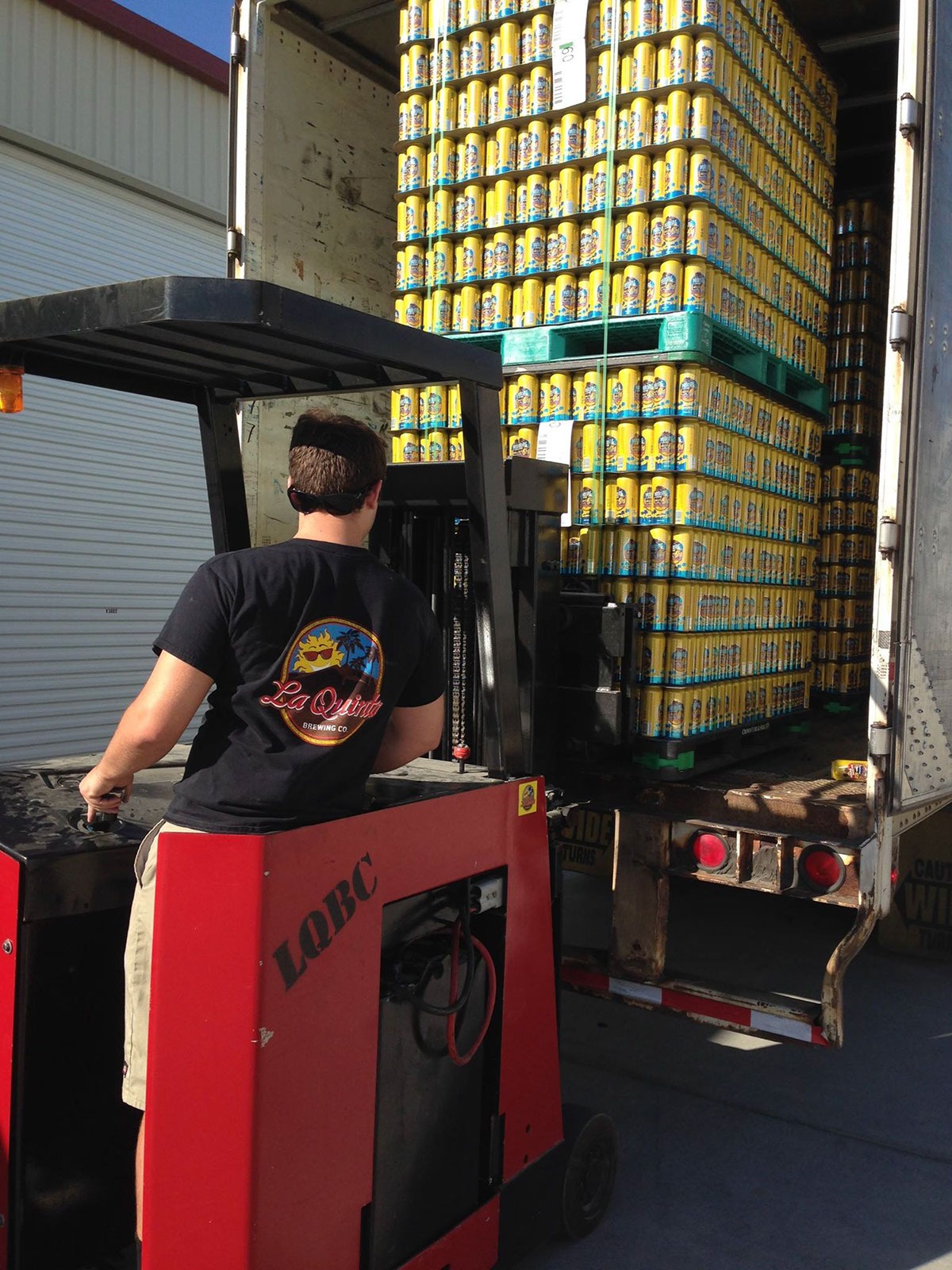
Seeing the earth tones and pops of bright colors that make the cans stand out on shelves and draw in consumers. After production, seeing the labels transformed into physical cans is a rewarding experience, as the designs come to life and perfectly capture the essence of La Quinta Brewing Co’s brand. The labels’ vibrant colors and intricate details look even more impressive when wrapped around the sleek aluminum cans, making them an eye-catching addition to any beer enthusiast’s collection.

